Every software got it's little thing. A special sauce you put into it and nobody really notice but that make everything look more tasteful.
Today secret I want to share with you is how the Melodink background gradient works. Generally when people think about gradient, it's something basic like a single linear gradient or a radial one.
However Melodink is so much more interesting than this. I used a combination of 4 layers to assemble what I find to be a such beautiful and light gradient. You can see below how each layers seem poor and week but when you merged everything together, you see the real strong of this composition.
Base layer

Gradient A
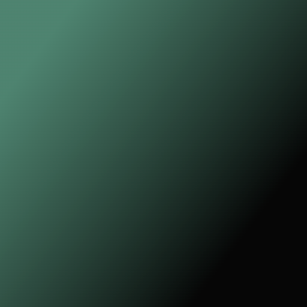
Gradient B
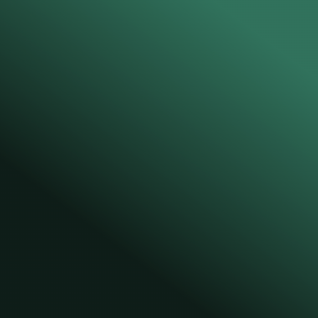
Gradient C

Everything combined

The way I achieved this effect was with a little bit of CSS (and also a little bit of JS and math).
First in my client.cssI defined new rules with background to define a stack of gradients
.app-background,
body {
  background:
    linear-gradient(
      var(--app-gradient-c-angle),
      var(--app-gradient-c-from) var(--app-gradient-c-start),
      var(--app-gradient-c-to) var(--app-gradient-c-end)
    ),
    linear-gradient(
      var(--app-gradient-b-angle),
      var(--app-gradient-b-from) var(--app-gradient-b-start),
      var(--app-gradient-b-to) var(--app-gradient-b-end)
    ),
    linear-gradient(
      var(--app-gradient-a-angle),
      var(--app-gradient-a-from) var(--app-gradient-a-start),
      var(--app-gradient-a-to) var(--app-gradient-a-end)
    ),
    var(--app-gradient-base);

  background-attachment: fixed;
}
Second I defined some @property and an animated class for theme transition
@property --app-gradient-base {
  syntax: "<color>";
  inherits: true;
  initial-value: transparent;
}

@property --app-gradient-a-from {
  syntax: "<color>";
  inherits: true;
  initial-value: transparent;
}

@property --app-gradient-a-to {
  syntax: "<color>";
  inherits: true;
  initial-value: transparent;
}

@property --app-gradient-b-from {
  syntax: "<color>";
  inherits: true;
  initial-value: transparent;
}

@property --app-gradient-b-to {
  syntax: "<color>";
  inherits: true;
  initial-value: transparent;
}

@property --app-gradient-c-from {
  syntax: "<color>";
  inherits: true;
  initial-value: transparent;
}

@property --app-gradient-c-to {
  syntax: "<color>";
  inherits: true;
  initial-value: transparent;
}

body.animated .app-background,
body.animated {
  transition:
    --app-gradient-base 400ms cubic-bezier(0.45, 0, 0.55, 1),
    --app-gradient-a-from 400ms cubic-bezier(0.45, 0, 0.55, 1),
    --app-gradient-a-to 400ms cubic-bezier(0.45, 0, 0.55, 1),
    --app-gradient-b-from 400ms cubic-bezier(0.45, 0, 0.55, 1),
    --app-gradient-b-to 400ms cubic-bezier(0.45, 0, 0.55, 1),
    --app-gradient-c-from 400ms cubic-bezier(0.45, 0, 0.55, 1),
    --app-gradient-c-to 400ms cubic-bezier(0.45, 0, 0.55, 1);
}
The reason I need to define those @property is to hint the browser my from and to variables I defined are colors. Otherwise the browser can't really be sured about that which will prevent transition to do the nice 400ms transition I want.
Also I don't put the transition in the main CSS class to prevent a second issue of when the page load. If I were to put transition before I applied my theme, the first apply would make a tiny transition from white to the theme. So with a tiny bit of javascript I can defer the animation to be only used after the first applied.
requestAnimationFrame(() => {
    document.body.classList.add("animated");
});
Last but that's where the sauce begin to became really complex. The way I want to define my gradients is different from what CSS want to use.
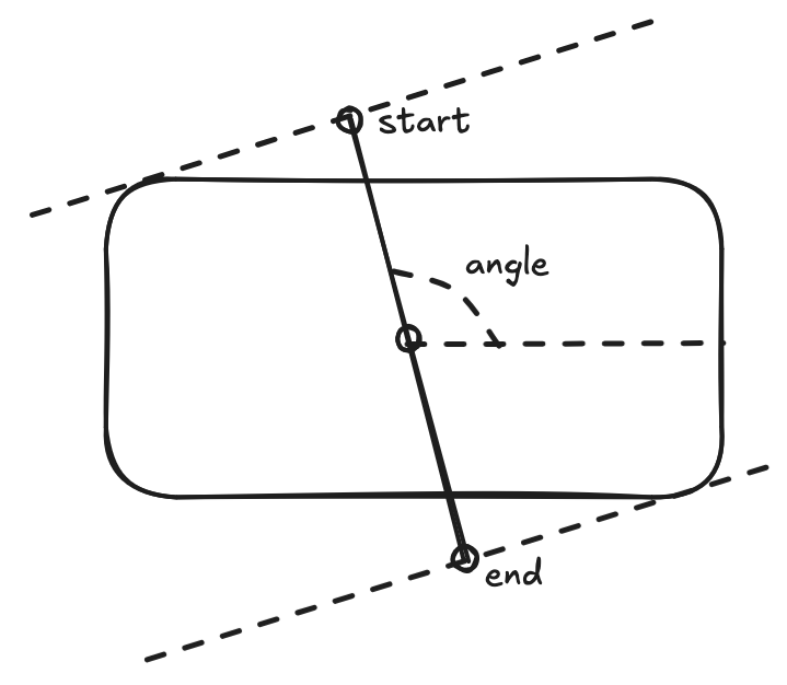
In CSS a linear-gradient is used with angle, from color, start, to color and end. You can think of that like if you were defining in the center of your shape a line with a specific angle, where you define the start and end will placed a point along this line where between those two points your gradient will be applied.
However the original background from the flutter version do not work like that. In flutter a BoxDecoration with a LinearGradient is defined in such way you are placing directly your two point with uv coordinate. This mean you are not placing a line around the center with an angle but directly based on the width and height of your shape. You place your two point to form the line.
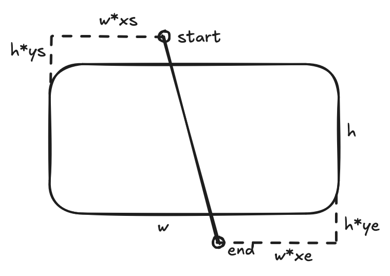
So because all of that I wrote this little JS function to do the coord conversion
export function computeCoord(angle, start, end) {
  const radians = (angle * Math.PI) / 180;

  const sin = Math.sin(radians);
  const cos = Math.cos(radians);

  const w = window.innerWidth;
  const h = window.innerHeight;

  const w2 = w ** 2;
  const h2 = h ** 2;

  let newAngle = (Math.atan2(w * sin, h * cos) * 180) / Math.PI;

  if (newAngle < 0) {
    newAngle += 360;
  }

  const ratio =
    (w2 * sin * sin + h2 * cos * cos) /
    (w2 * Math.abs(sin) + h2 * Math.abs(cos));

  return [newAngle, 0.5 + (start - 0.5) * ratio, 0.5 + (end - 0.5) * ratio];
}
I don't want to explain this code so I will just say to you it take the angle, convert it into uv coordinate, stretch them to fit a rectangle, compute the angle the line would do and than compute along this line where the start and end should be.
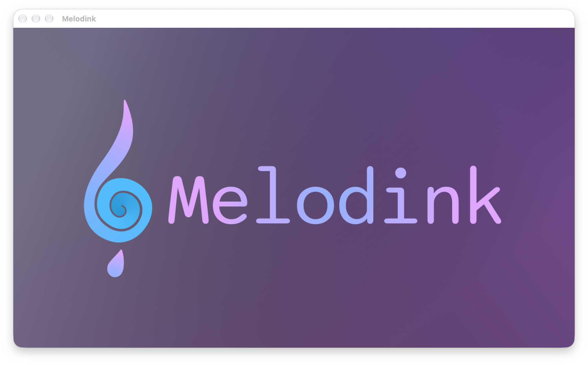
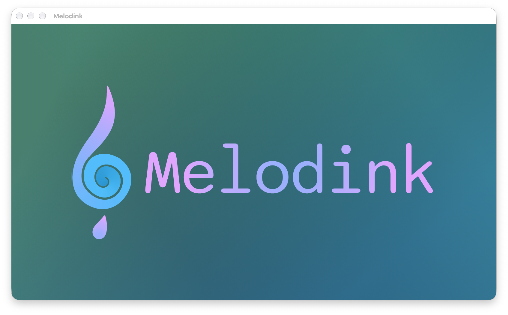
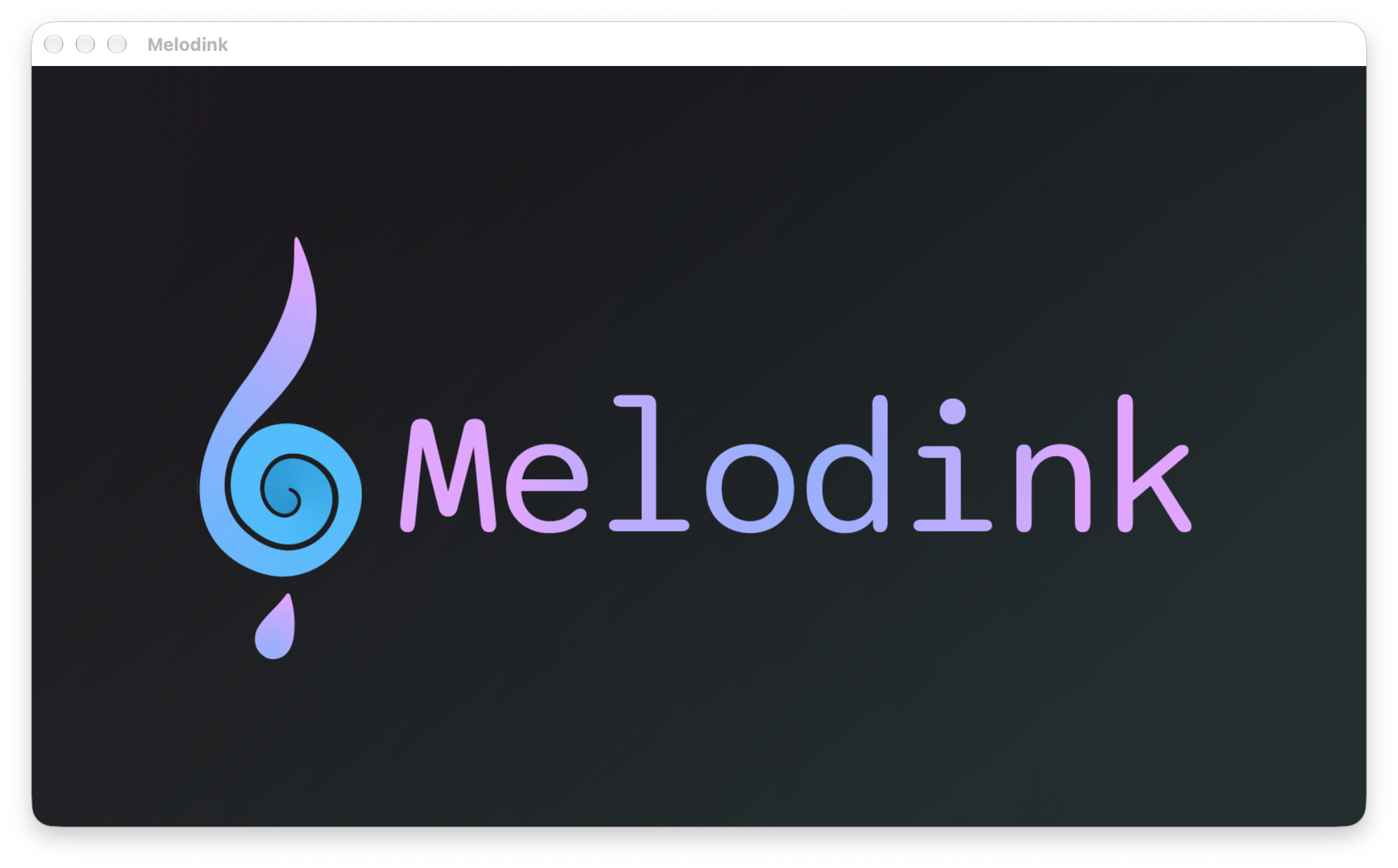
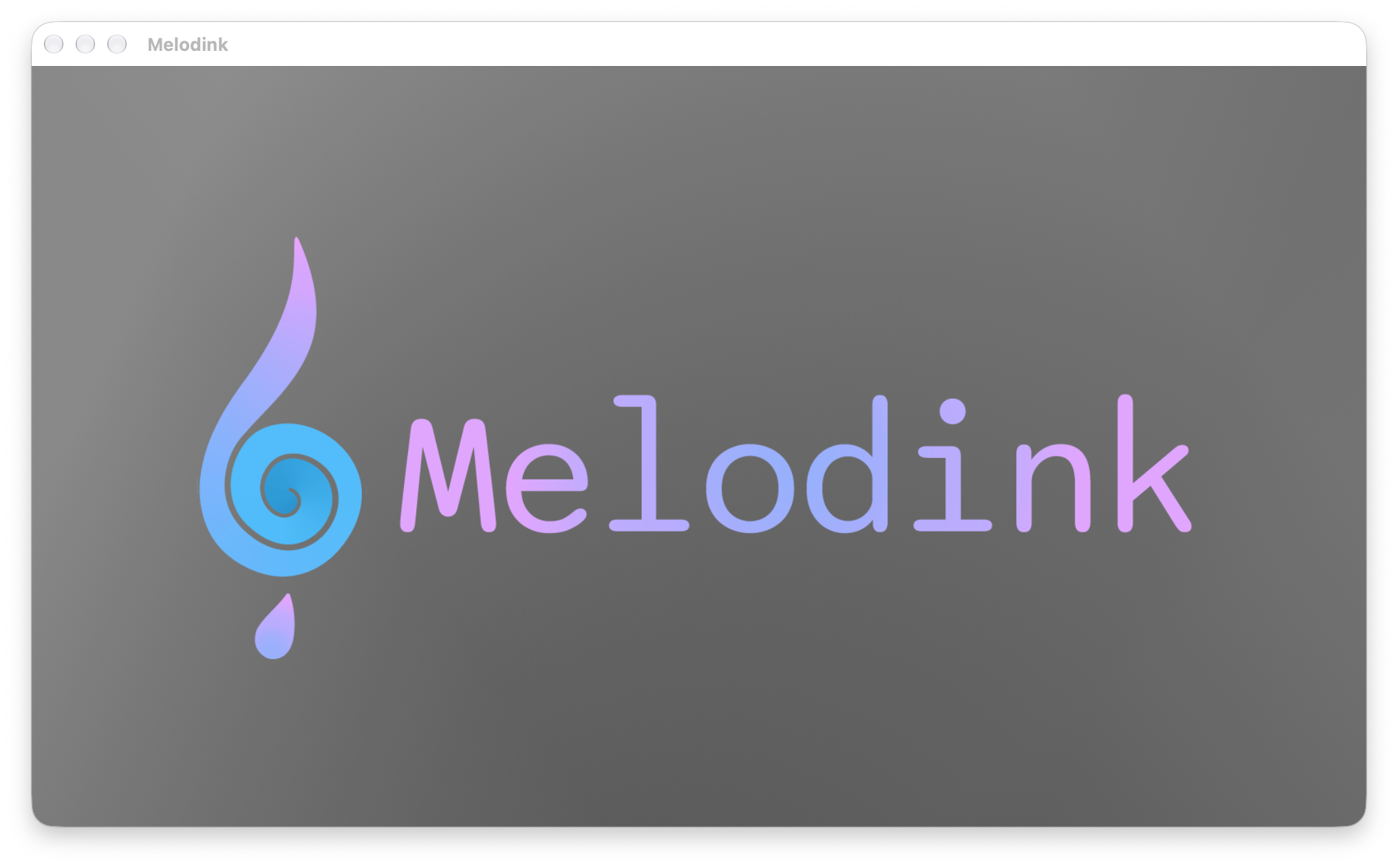
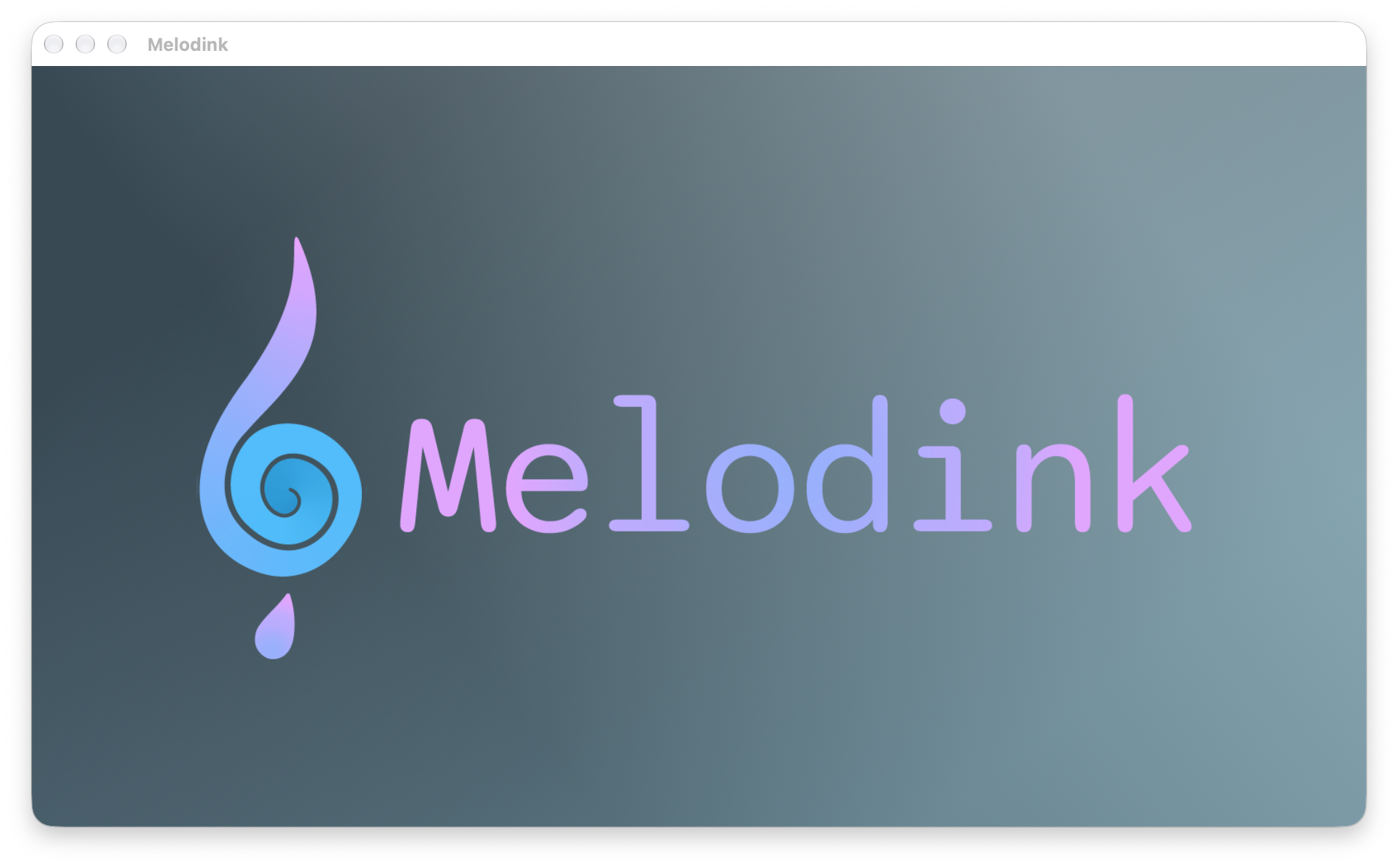
But anyway when I put everything together. In my gleam code with just a tiny theme.apply(theme.cyan) from my theme module I'm able to get those beautiful themes :
You can find all the final code I talk here and also some boring stuff I didn't wanted to talk like the code of the theme module or the way I applied with JS the CSS variables https://github.com/gungun974/Melodink/commit/cb2be3f15d8ea9c0c55317b9d09f43fe906da945